
It is easy to understand how executive dashboards have become so chic. Most products come to mass market by way of technological advancements. The 3-D movies fascinated audiences in select theaters for decades. Now, we have 3-D TVs in our homes. By the same token, specialized and complicated business intelligence software (like Cognos) existed since the 70s. However, the 21st century brought forward adaptable, customizable, open-architecture systems and integratable reporting tools.
Business intelligence and financial performance management are not new ideas. Data warehousing may sound like a novelty, but collecting and organizing records in a particular order for easier access existed for centuries. The concept of information as a key to business success is millennia old. How many spearheads you are going to make, if you don’t know all the warriors in your tribe?
Of course, nowadays data flows are more complex. The CFO’s and CEO’s need information integrated from different sources and they need it fast. So, the developers caught up with the demand and offered executive information systems aka dashboards. They advertise, give distribution licenses to specialized vendors, hold conferences, etc. As usual, standardization is mandatory in order to capture larger market shares, and that’s where the fallacy forms.
Don’t get me wrong, they are beautiful visual arrangements – much more vivid than dry columns of numbers, far more impressive and memorable. On top of that, more expensive ones allow you to drill down into the data behind them. That’s incredibly cool!
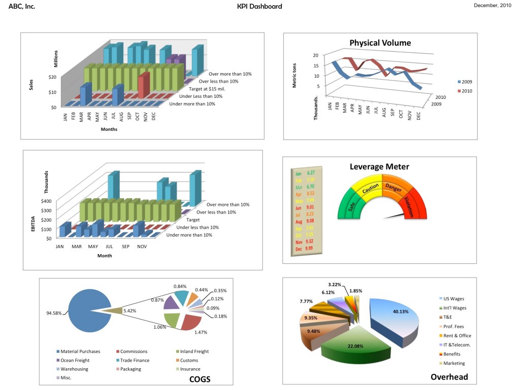
Here are some of mine own:
Yet, in far too many instances the form obscures the substance. Now, the users think they need something looking exactly like that, instead of thinking what info is fed into it. And it is very sad, because CEOs and CFOs in need of sensible information, frequently end up just looking at a pretty picture.
I’ve seen a lot of dashboards – most of the time I find them absolutely irrelevant. You are looking at your 12-month revenue curve and it displays expected cyclical pattern. What are you learning here after spending a tidy sum for ability to generate this graph with a push of a button? Nothing new – your last year curve had exactly the same shape. How do you know whether you are doing better or worth now than a year ago?
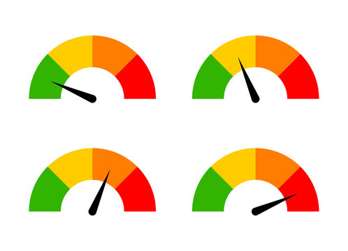
And the gauges!!! They look awesome and they justify the name “dashboard,” but they are the most difficult charts to read. Moreover, they are kind of useless for static information. Unless a constantly changing (and most importantly, crucial) information is fed into this device in real time, you have no reason to stare at a red circle with green border and unmoving black arrow.
Here is my advice: don’t fall for colorful pictures. Start from the beginning. You know which information is most important for you and your CEO, which parameters affect your business’s ability to survive. Figure out what combination of data would make the real impact on your decision-making, how frequently you want see it, whether it needs to be dynamic or static, etc, etc. Only after that you can think about the format.
Let’s say your product’s price is in direct correlation with crude oil market. In this case, may be the two sets of data should be presented together, or maybe it’s most important to look at the units, not the sales dollar value? Those are the important decisions, not the shapes and colors.
It is very possible that you need bar charts, graphs, even gauges. Hey, if you are a jewelry manufacturer and make raw material procurement decisions all day long, there is nothing wrong with having a gold price meter installed right in the center of your screen. At the end of the day, it is all about common sense.
